

Scaling Data Visualization to Support Product Growth
D1 is Cloudflare’s SQLite database product, designed to give developers a simple, low-latency way to store and query data at the edge. As the product evolved, the team introduced Read Replication, a new feature that allows databases to serve read requests from multiple regions for faster performance and improved reliability.
I was responsible for redesigning the metrics dashboard to support this new functionality and help developers visualize data across regions and replicas.
What began as a layout problem quickly turned into a data comprehension challenge. One that required reframing how developers explored performance insights across regions and database placements.

<!--
Things to know
-->
Company:
Cloudflare
Role:
Product Designer
Tools Used:
Figma | Internal Design System
Project Duration:
Q4 2024 - Q1 2025
<!--
Summary
-->
🚨 The Challenge
The introduction of Read Replication added complexity: each database could now have multiple replicas across regions, each with its own metrics (latency, read/write ratio, request counts, etc.).
Our existing dashboard structure (designed for a single primary database) couldn’t scale.
I initially approached the project as a visual puzzle, exploring ways to “fit” more metrics and replicas into the interface. But the more I iterated, the more I realized adding information didn’t equal understanding.
The real challenge was not how to show everything, but how to show what mattered most.
Amongst all of these things, we faced tight engineering bandwidth and a limited design system.
🙋🏾♀️ My Involvement
Product Designer for Cloudflare D1
Partnered with engineering to identify scalable technical patterns
Partnered with product management to define and shape project requirements
<!--
The Project Steps
-->
1) System Architecture Overview
I coordinated with engineering & product management to review the project requirements document (PRD), and from that I created flow diagrams (with their continuous consultations) for us to visually align on the underlying system requirements
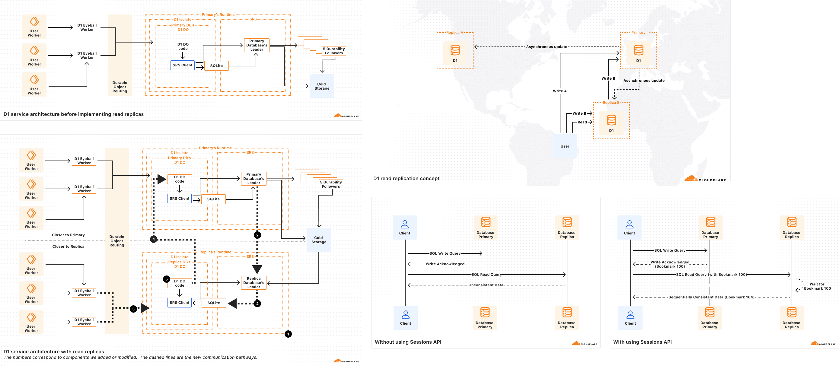
2) Mapping Architecture to UI Needs
After understanding the functionality of Read Replication, I began mapping extracting the potential UI requirements, that would be presented in the Dashboard
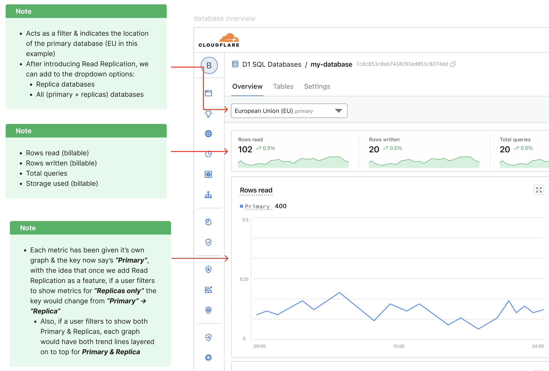
At this stage, my mindset was still focused on representing all replicas at once. My initial understanding of the task, was that we would need to fit a lot of content onto the metrics page.
The goal was to ensure that every replica, metric, and interaction could be accounted for.
To do this, I broke the architecture down into key technical functions, identified what questions users might have about each, and defined the corresponding UI requirement.
Technical Functionality | User Need / Question | UI Requirement |
|---|---|---|
Multiple replicas across regions | Which region is serving which reads? | Add "region name" as label on chart |
Read vs. write separation | Where are writes vs. reads happening? | Show primary vs. replica labels and metrics |
Replication lag | Is my data synchronized? | Include replication lag metric or status indicator |
Regional routing | How are requests distributed geographically? | Display requests per region chart |
Performance monitoring | Are replicas healthy and performant? | Summarize latency, request count, error rate per replica |
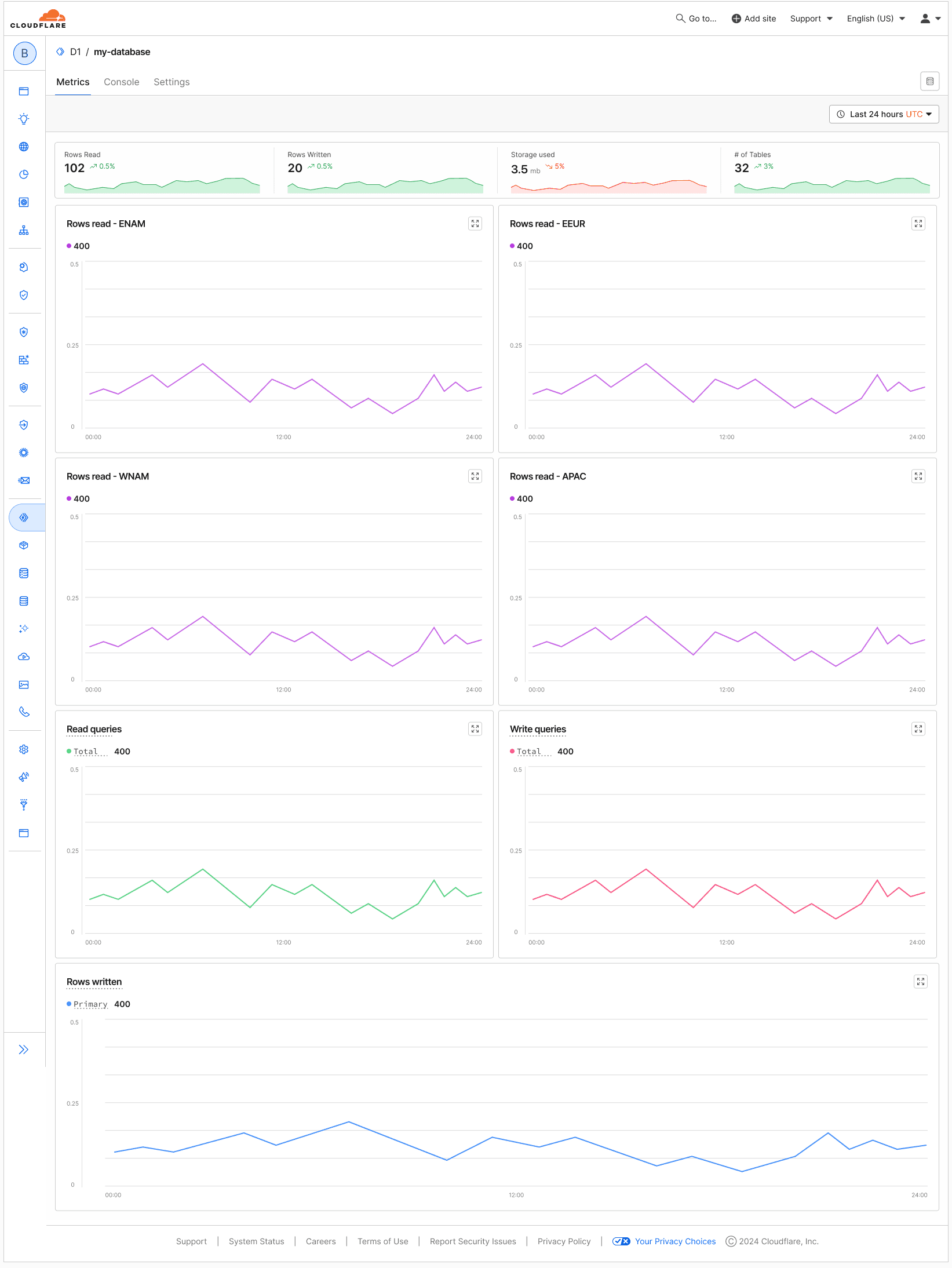
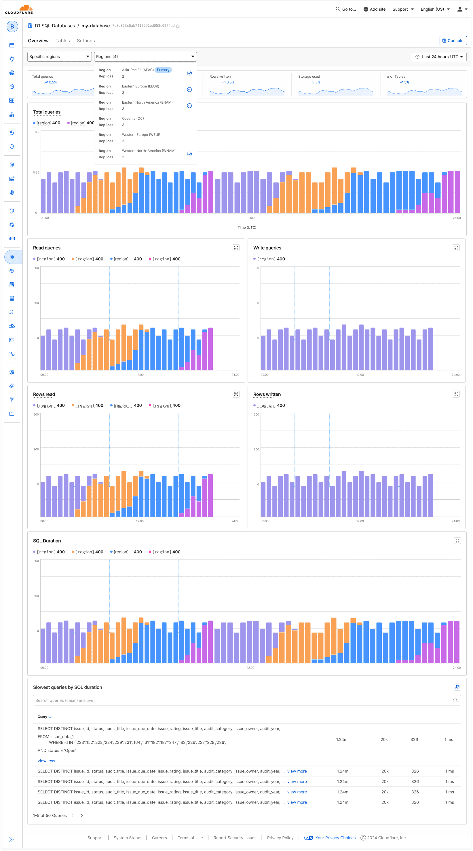
3) Restructuring the layout
After defining requirements, I began redesigning the dashboard layout. The original tab-based design made it hard to view metrics holistically:
Because of this, I decided to move towards a tile-based layout that presented all key metrics on one page.
Moving towards a tile-based layout, was an improvement I'd identified prior to this project, and I found this as the perfect opportunity to take advantage of existing engineering resources during this project.
This shift also required me to explore data grouping patterns, deciding when related metrics (like rows read and rows written) should share a single card vs. live in separate tiles.
After several iterations and team reviews, I landed on V1 of the designed, tile-based dashboard with grouped metrics for improved clarity and scale:
4) Rethinking the Approach
After landing on V1, I started to realize something wasn’t clicking. Even though the new tile layout improved structure and clarity, trying to fit everything under on one page wasn't exactly proving to be as scalable as I'd initially imagined.
The more replicas I added, the more cluttered and heavy the experience became.
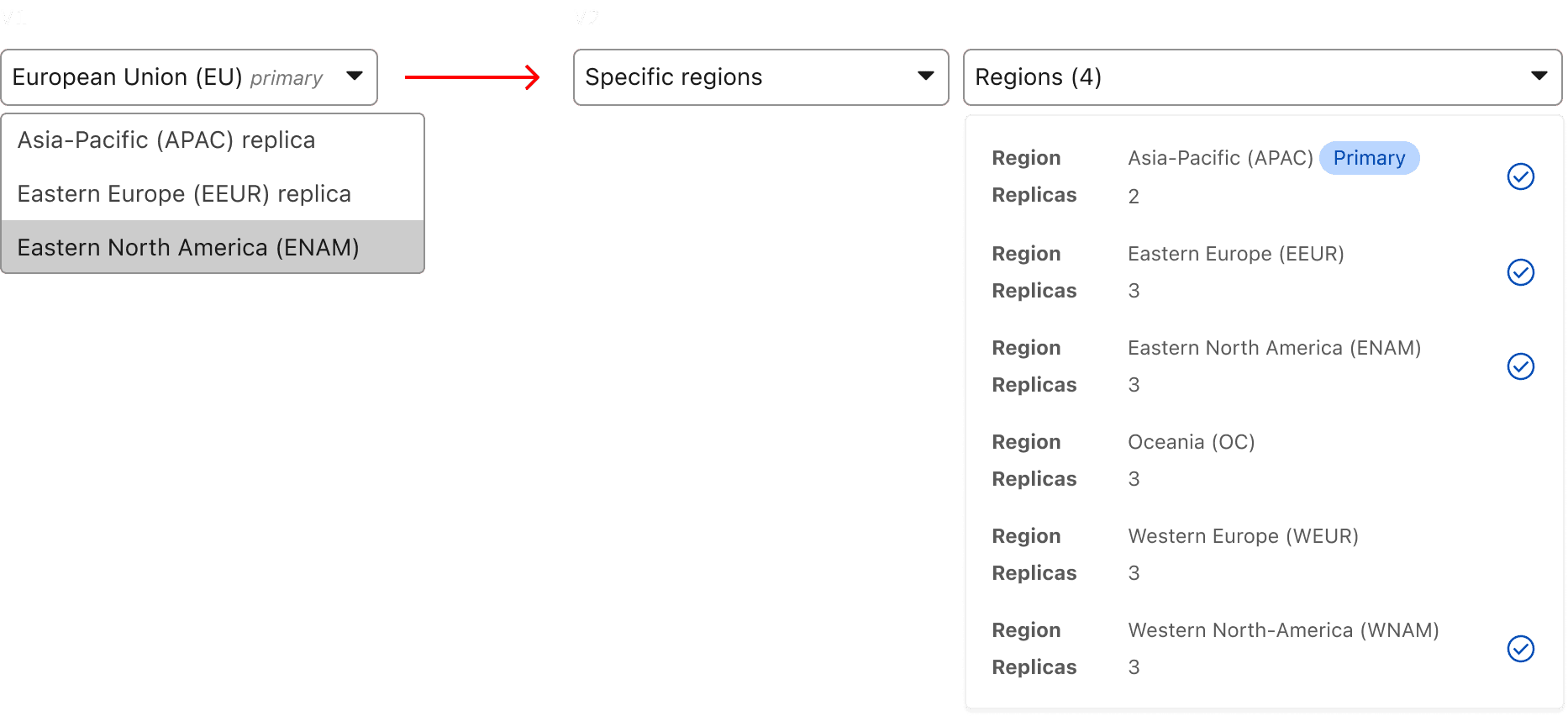
After rethinking the problem, it immediately became clear that Read Replication wouldn't just require me to redesign the page layout, but instead also think through a new imagined filtering experience.
With this in mind, I was able to consolidate on cards by adding a filter at the top of the page:
Soon after, I realized that I would need to disclose more details other than the region name in the filter. Because of this, I evolved the filtering component to account for details:
5) Refining the Visualization
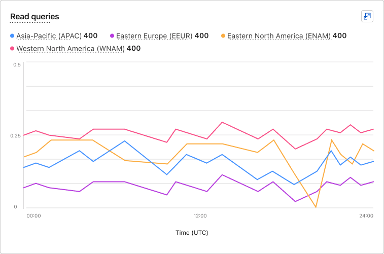
Once filtering was introduced, I was able to consolidate the dashboard into fewer, more focused cards. The filtering system worked well, but the data visualization itself still needed improvement.
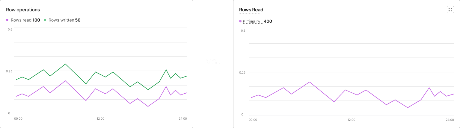
Up to this point, all metrics were displayed as line graphs, which made it difficult to consume the data. Overlapping lines cluttered the view and failed to communicate volume of data effectively.
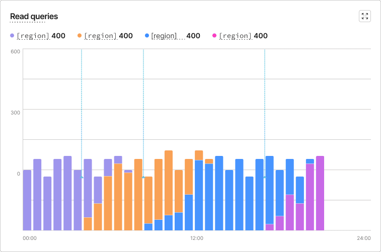
To fix this, I introduced stacked bar charts, giving users a more clear way to understand the comparison between replicas, at a glance.
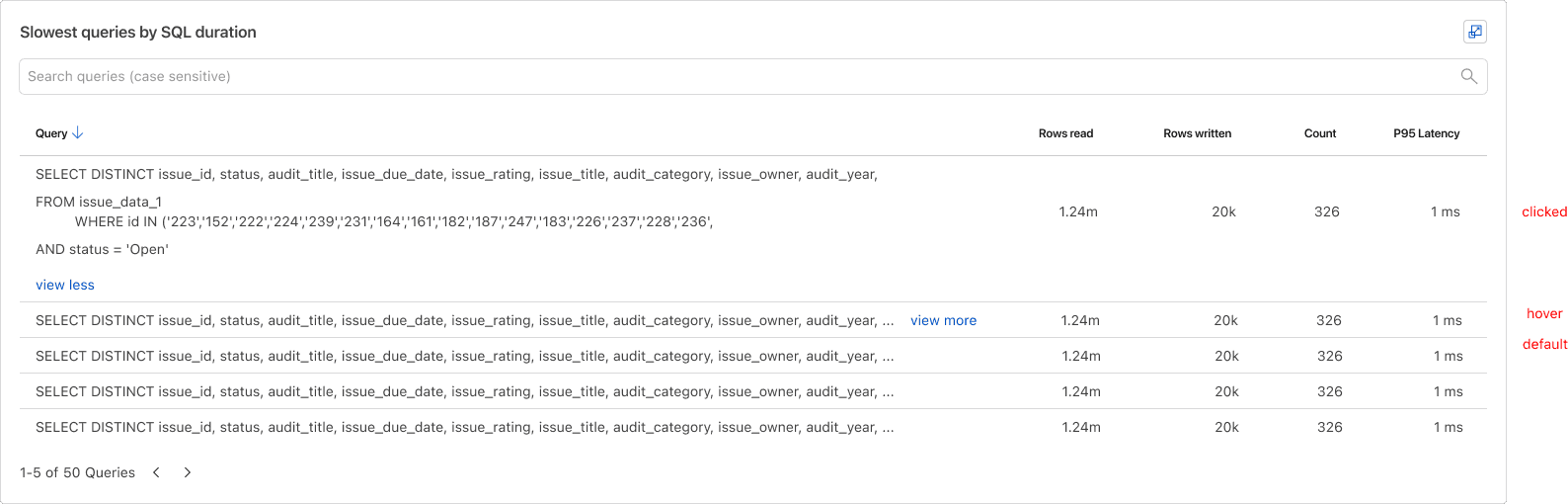
6) Adding the Slowest Queries Table
With the new layout, improved visualizations, and a streamlined filtering experience in place, the final piece was integrating the Slowest Queries table into the dashboard.
This tool introduced a new layer of interaction design, since it required allowing users search + view returned results.
By thoughtfully placing the table below the visual cards and refining the interactions (sorting, hover states, and expandable rows), I ensured users could drill into query-level insights without losing context from the broader dashboard view.
Original Design
Final Design
Outcomes
Successfully launched the Read Replication feature, enabling developers to monitor multi-region database performance directly from the dashboard.
Introduced a new filtering component that allowed users to isolate replicas and view data in meaningful context.
Significantly improved data visualization and layout, replacing tabbed views and line graphs with a modular, tile-based structure and stacked bar charts for clearer insights.
Designed for scalability, establishing a flexible framework that can support future metrics, data dimensions, and replication features with minimal redesign.

